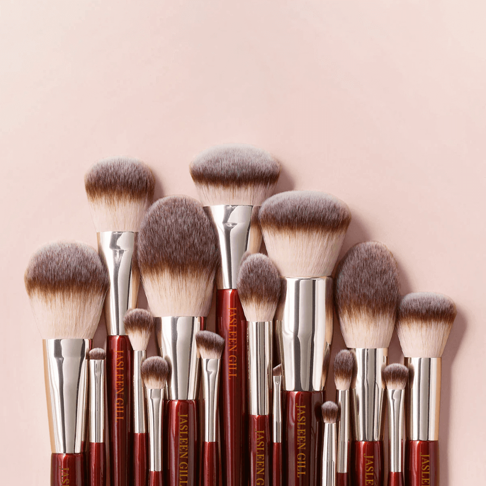
Jasleen Gill
Jasleen Gill The Jasleen Gill logo is a monogram designed with the letters J and G. The brand personality is very clinical and minimalistic, depicted appropriately through this simple, single-color logo.


Jasleen Gill The Jasleen Gill logo is a monogram designed with the letters J and G. The brand personality is very clinical and minimalistic, depicted appropriately through this simple, single-color logo.
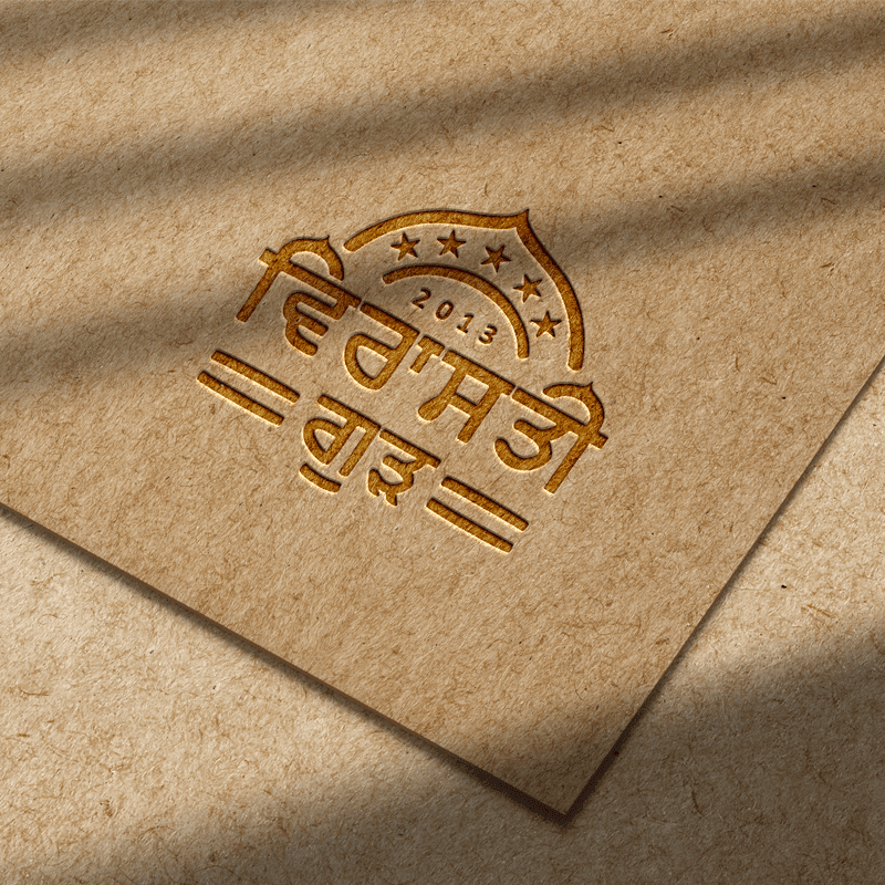
Virasti Gur The Virasti Gur logo is an emblem designed with the name written in Punjabi and above it, a design element that resembles the dome of a Gurudwara, depecting the honest and wholesome nature of the brand. Despite being a relatively new brand, it gives the vibe of a traditional brand with a history.

Orient Tanks Orient Tanks logo is a wordmark with the first letter (O) of the brand name designed to look like a water tank.
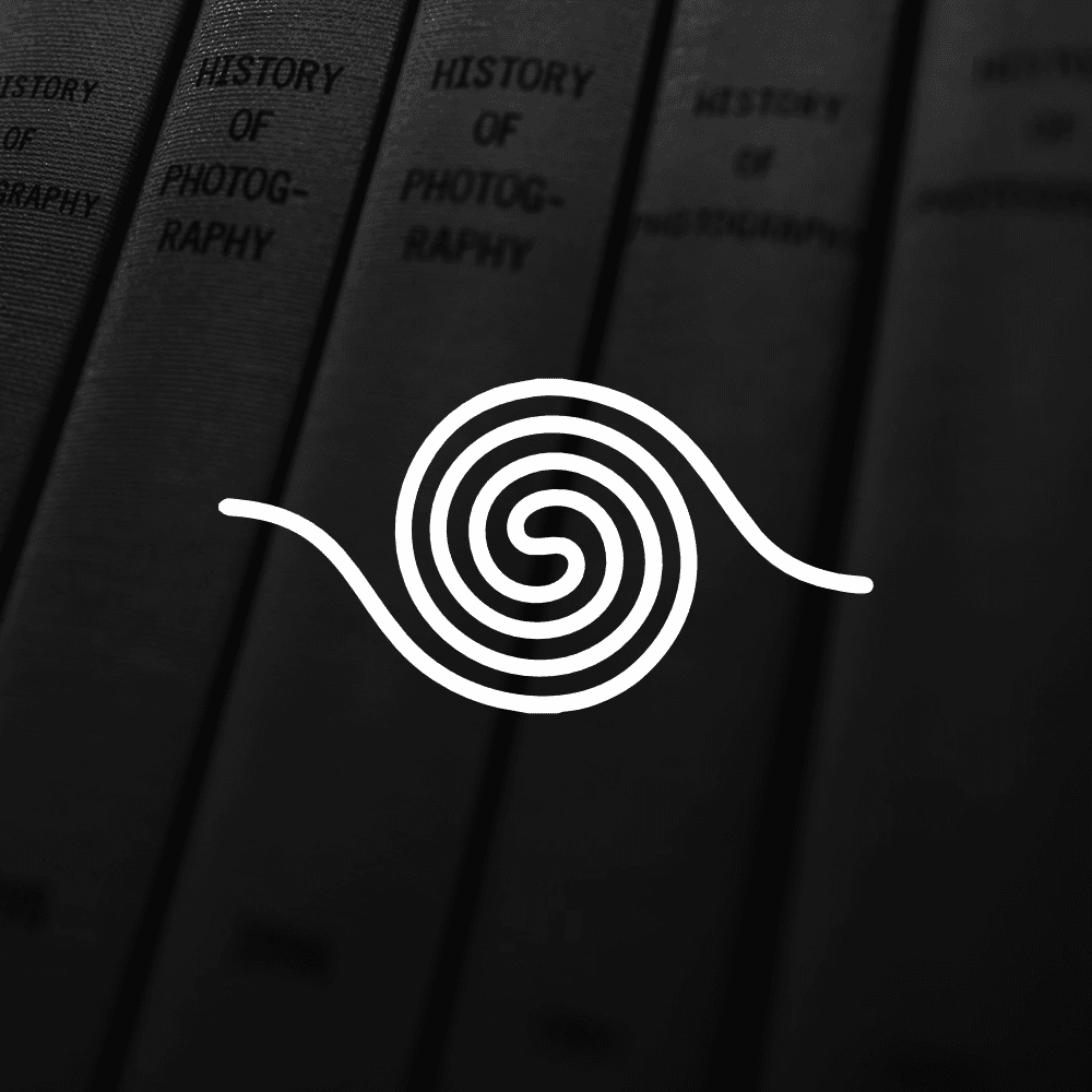
Spellbound Publications The spellbound logo is a spiral shaped S, depicting the journey and depth ones treads when reading a book.
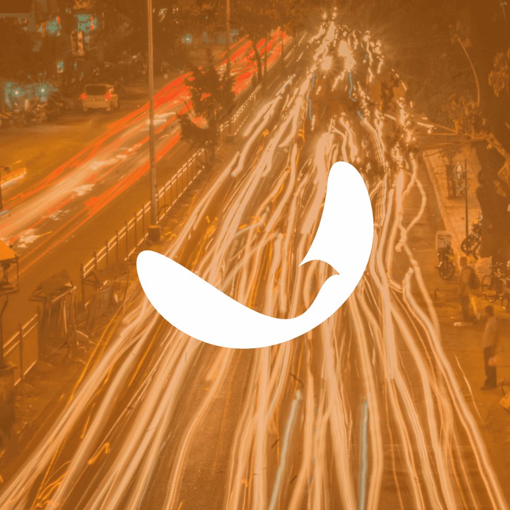
Chidiudd Pollution & Insurance Centre The name Chidiudd is borrowed from a popular Punjabi game. Using the name provided immediate connect with the people of rural Punjab, which is the major target audience of Chidiudd. Chidiudd offers services like pollution checking, vehicle insurance and vehicle loans. Within a few months of inception, Chidiudd had a

Homoeotouch The Homoeotouch logo consists of five components, each representing one of the five elements that are the foundation stones of homoeopathic medicine. The soft-edged elements are a nod to the gentle approach that homoeopathic medicine takes to heal your body and mind.
PLM Insurance Agents The PLM Logo is a lettermark, designed with a custom typeface created specially for PLM. The color blue inspires trust that’s so essential for a financial institution to project. Slanted, bold typeface gives it a confident outlook.
baba milk baba milk logo designed by Juggy is a wordmark, designed using a custom made typeface designed especially for the baba milk logo. It’s soft-edged, friendly and appropriately thick to represent a dairy brand that stands for good health, joy and strength.
AMMY BESPOKE The Ammy Bespoke logo is a simple monogram depicting the shirt collar, which can also be seen as the capital letter A. The contrasting black and white brand colors give the brand its visual power, reinforcing the brand tagline – men in power.
FRYDAY In the realm of cafe branding, where every element holds the power to evoke cravings and culinary contentment, a delicate dance unfolds between the realms of taste, experience, leisure, and a profound sense of belonging. It’s a canvas where the aroma of freshly brewed stories mingles with the anticipation of flavors yet to be