Journey Masters
Journey Masters The Journey Masters logo is the letter J designed using two upward going arrows, symbolising flying and career progress.


Journey Masters The Journey Masters logo is the letter J designed using two upward going arrows, symbolising flying and career progress.
Kisan Outlet A distinctive lettermark featuring the Punjabi letter “ਕ” (Kakka), designed into a simple yet memorable symbol. The mark evokes authenticity and regional pride, while maintaining a modern, versatile aesthetic.
Hamees A regal lettermark crafted around the motif of the letter “H,” reflecting the premier, luxurious personality of the brand. The design blends heritage and sophistication, ideal for a high-end identity.
Dermavista A refined monogram combining the letters “D” and “V,” created to appeal to a discerning, high-end audience. The mark also reads as “Dr.,” a subtle nod to dermatology doctors, making it both strategic and elegant.

Education Planner A clean pictorial mark featuring a plane in flight — a fitting metaphor for academic journeys. Cleverly constructed to also resemble the letters “E” and “P,” the design is both functional and symbolic.
AA Photography A conceptual pictorial mark that transforms the initials “A” and “A” into a minimal camera and tripod. Designed for Aman Aulakh, the logo reflects both the individual identity and the essence of photography.
Ludhiana District Cycling Association A vibrant pictorial identity formed by integrating the letters “L,” “D,” ‘C” and “A” into the frame of a bicycle. The mark captures motion, unity, and the spirit of community cycling.
KRUX An abstract emblem designed to embody the energy of an urban, unisex gym. Bold, minimal, and edgy, the logo speaks the language of modern strength and street-level fitness culture.
KHAAS A refined wordmark continuing the Punjab Fabrics design tradition of featuring the first letter in Punjabi — here, the “ਖ” (Kha). Crafted for a luxury fabric store, the design balances tradition with quiet opulence.
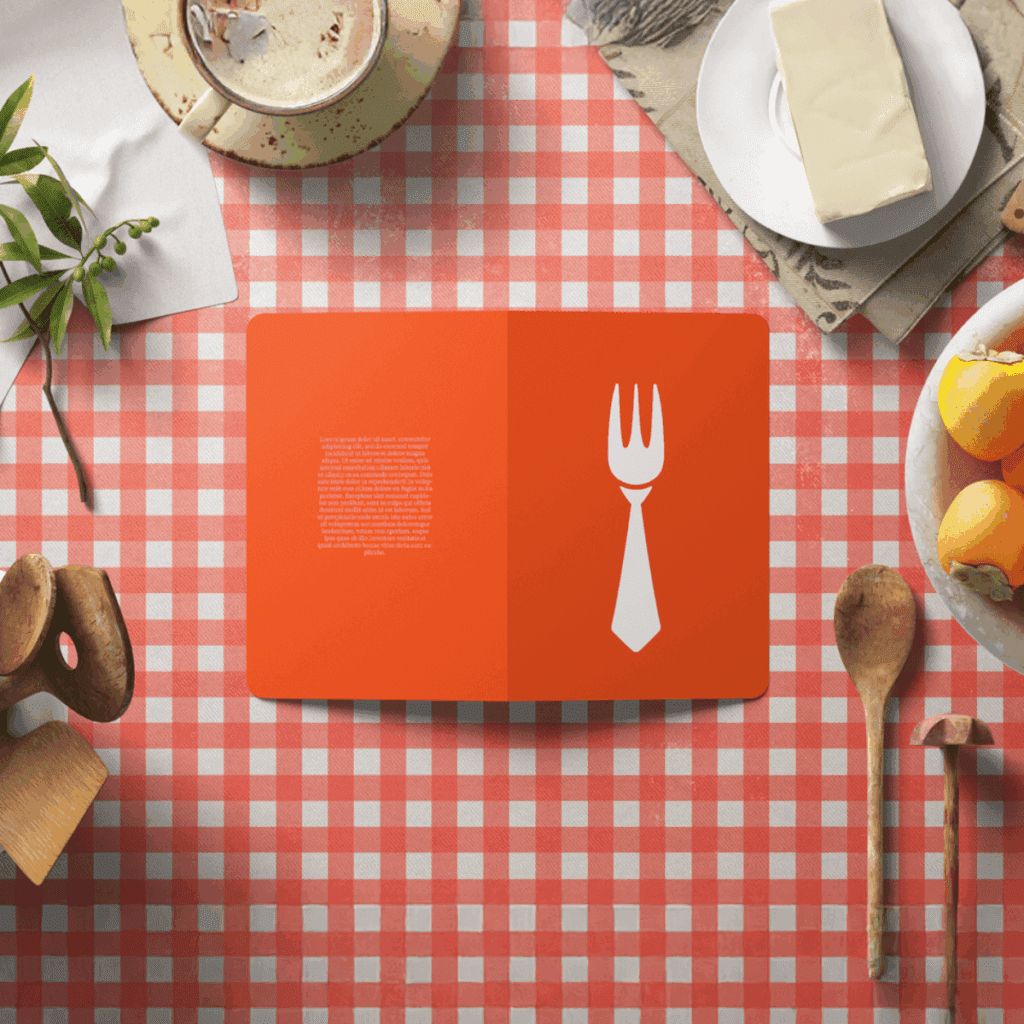
Brunch Manager A clever pictorial mark that fuses a fork and a necktie, hinting at the founder’s journey from bank branch manager to chef. The brand name was also coined by Juggy.